
One month into this project, I'm starting to pay more attention to my week - I am photographing little things, photography every day moments that I wouldn't have before. So far this year, my photos have been dark and full of contrast. Do you ever notice color stories appearing in the photos you take?
This week, the photos I had planned to use didn't print well and I felt frustrated with my spread. It had all made sense with those now missing photos. Printing photos once a week is stressful enough so I decided to make it work. And I think that must be when magic happens because I am a tiny bit obsessed with this spread now that it's done.
Left //

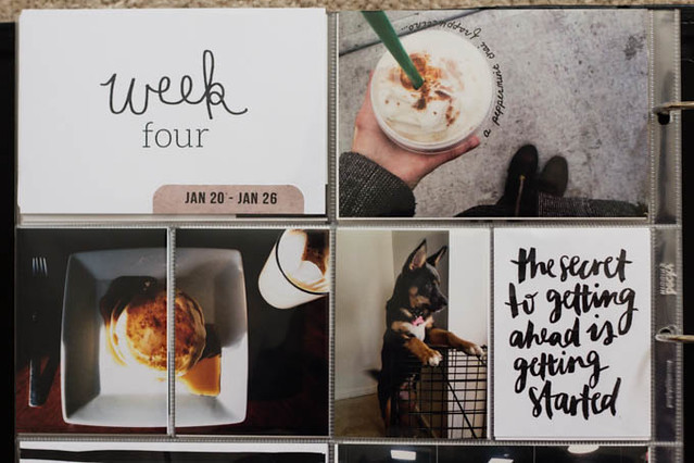
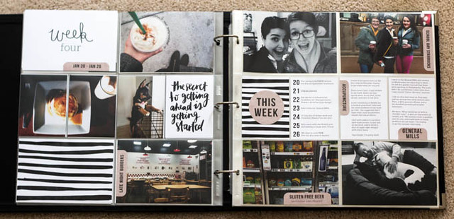
With the start of school and several events this week, I was busy, leaving little daylight for photographs at home. So, this week features a lot of "out and about".
Inspired by Julia's spreads on Instagram, I decided to try writing directly onto a photo. I've tried each week to incorporate my own handwriting and until this spread, I had failed. I really love the effect and this Starbucks drink was a first - a peppermint chai frappuccino! Yes, it's a thing.A thing you should try.
It seems as though this page is mostly about food. I included a breakfast photo because Trevor took the time to make me pancakes for breakfast twice this week. We also cheated and had Five Guy's burgers after a fourteen hour day on campus. Trevor had never been before and I deserved it after an eye exam, orthodontist appointment, photography job, and class. Right?
The details: Stripes card printed from Big City Quiet; brush script quote card from Jasmine Dowling
(I haven't been a fan of quote cards on pages but I felt that this one just fit my week so well.) While Jasmine's prints aren't created for Project Life, they scale down to a 3x4 card perfectly.
Right //
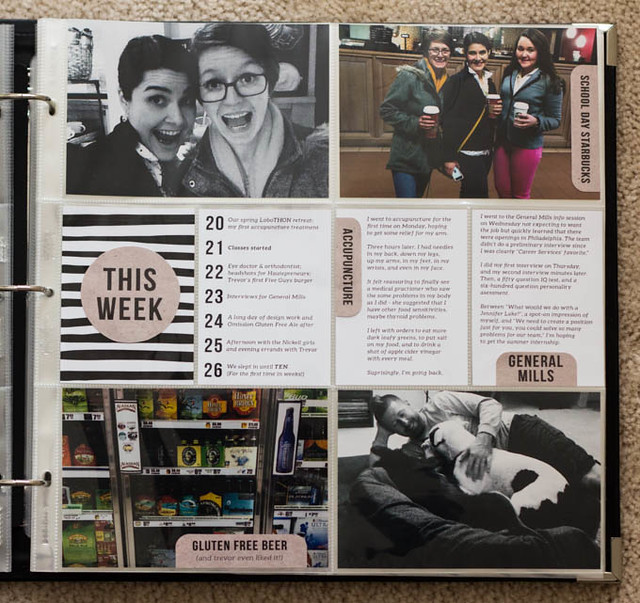
The right side of this week's spread includes... well, more Starbucks. Even though we make it to Starbucks multiple times a week in various groupings, this was the first trip of a new semester and totally worthy of a photo. Or two. And we may have asked a total stranger to take the group shot... No shame in this group.
The photo of Kate and I has to be my favorite one this week. As I said on Instagram, I think every girl needs a friend who wears the same clothes, makes the same faces, and talks at the same (rapid) speed. Kate is that friend.
I also included a snapshot from the local gas station's cider selection. Always classy. And a photo of Trevor and the babies all stuffed into a dog bed together.
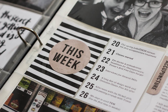
To journal this week, I used another one of Rachel's striped cards and added a kraft paper label. I also printed out a week in review card with the days dates - this week was so full but not everything could be photographed, like the start of classes or sleeping in on a Sunday. I also used two blank white cards to journal about my first acupuncture appointment and interviewing for a summer internship.
I really love captioning my photos since I'm not sure that I will remember the details even a year from now. This week's spread really came together with the kraft paper labels across both sides of the spread. I find that these little details can bring balance to my spreads.
I love how dark and contrasty your spreads are. Makes me want to go all black. Loving your layouts more every week.
ReplyDeleteLove all the black and white. I Liebster Award-ed you ;) (know you've been awarded a few times now) http://thelittlekicks.com/blog/2014/03/31/the-liebster-award/
ReplyDeleteI am finally getting around to checking out the Liebster Award winners from Caylee Grey's blog and that is how I found you! I resonate with your PL spread here because I am typically doing neutral spreads and I love them. I also really like your kraft tags you've used here. Are they something you make or purchase?
ReplyDeletelove how you used my striped cards! xo
ReplyDelete